Serious writing for
serious readers
This is the most authoritative study I have seen of equity, bond and cash investment returns over the last century in 16 countries, including the USA, UK, France, Germany and Japan.
Summary
25 June 2016
What has been the historical long-term rate of return on equities and bonds?
This simple question is surprisingly difficult to answer. Much of the information printed in the press prior to the publication of this book was simply wrong. This book, in just over 300 pages, summarises the serious research of the authors and provide a definitive answer.
All three of the authors were at the London Business School when it was published:
Advertisement
Click image

After the preface, the first 16 chapters set out “101 years of global investment returns.”
The second part of the book “Sixteen countries, one world” gives more details of the country by country data:
Below I have included just a few extracts to illustrate the style and detail of the book.
The authors explain how much effort was required.
“Good data is the key to understanding history. With this as our guiding principle, assembling the data for this book was a major task. For the United Kingdom, ABN Amro supported us in compiling an authoritative record of UK equity market performance over the last 101 years. We did this because we were not satisfied with the data that previously existed, and there was anyway no comprehensive record of equity returns extending back to 1900.
To construct our UK indexes, we devoted intensive efforts to financial archaeology. This involved transcribing original source data from dusty newspaper archives and ancient reference books into our database. The resulting benefit is that we have not simply assembled an index, but we also have the underlying stock-by-stock data, so we can now study the performance of segments of the market, such as industry sectors and market-capitalisation bands. We also compiled a series of UK government bond indexes especially for this study.
For the other 15 countries covered in this book, we have linked together the best quality indexes and returns data available from previous studies and other sources, a number of which are previously unpublished, and some of which are still work in progress. In addition to the United Kingdom, we cover two North American markets, the United States and Canada; 10 other European markets, namely Belgium, Denmark, France, Germany, Ireland, Italy, The Netherlands, Spain, Sweden and Switzerland; two Asia-Pacific markets, Australia and Japan; and one African market, namely, South Africa.
Taken together, these 16 countries make up over 88% of today’s world market capitalisation, and were also dominant at the start of the 20th century. We estimate that in 1900 these countries represented at least as high a proportion of the world equity market as they do today.
In each country we cover the same asset classes: equities, bonds, bills, inflation, and the local currency. We are therefore able to make comparisons between the investment performance of different asset classes, in different economic and political environments while focusing on whichever time period is of interest. We also have annual gross domestic product (GDP) data for all 16 countries over the entire period.
Unlike most previous long-term studies of global markets, our investment returns all include reinvested income as well as capital gains. Our new indexes are more representative than those used in any previous study, and cover a longer time span for a larger number of countries. Furthermore, the common start date of 1900 facilitates cross-country comparisons. We can now set the US data alongside comparable length series for the same asset classes for 15 other countries, and make international comparisons that help set the US experience in perspective.
Measuring what has happened in the past is only the starting point for assessing the future. Interpretation of the data and being able to apply it to a modern-day canvas are as important. Throughout this book, therefore, our emphasis is not simply on describing the past, but also on interpreting what has happened, with an eye to what it tells us about the future.”
The authors begin with a question.
“Why are stocks thought to perform so much better, over the long run, than government securities?
The explanation is that the equity premium has been large relative to stock market volatility. In Valuing Wall Street, Smithers and Wright (2000) define the stable value of the historic real return on common stocks as “Siegel’s constant,” or s. They explain: “We cannot know with certainty what the true value of s actually is, but we know that it cannot lie too far from our best estimate of 6 ¾ per cent… Why s is, or appears to be, so stable is an important challenge.” Siegel’s constant is cited more frequently in Smithers and Wright’s index than any other word, phrase, author.
In his forward to Siegel’s (1998) book, Stocks for the Long Run, Peter Bernstein writes: “The most powerful part of Professor Siegel’s argument is how effectively he demonstrates the consistency of results from equity ownership when measured over periods of 20 years or longer.” After noting that even Germany and Japan bounced back after the Second World War, Bernstein continues: “Indeed, he would be on frail ground if that consistency were not so visible in the historical data and if it did not keep reappearing in so many different guises.”
Siegel did not invent s and would be among the first to agree that its constancy is an empirical question.
In this book we present evidence that spans many countries. We show that the equity premium is not constant across markets. More often than not, stock-market volatility has been larger in other countries than in the United States. As a result, stock-market performance around the world looks like less of a sure thing than historical performance in the US and UK markets.
From our global perspective, and looking toward the future, equities are far from risk-free even over the long term. This is not to do with a paradigm shift; rather, it reflects the fact that inferences from a single information source are fraught with difficulty. Our new international dataset provides an opportunity to test out the reliability of trading strategies that are predicated on the superiority of equities over fixed-interest investments."
The authors go on to consider what their historical data can tell is about the future in a section headed “Market risk in the twenty-first century.”
“Predicting the future is difficult; it is easier if we assume the past will repeat itself. But we should be cautious about unthinking extrapolation into the future for at least two reasons: sampling error and survivorship. To understand the issues involved in extrapolating from the historical record, we start by looking at the US record from 1900 to the present day.
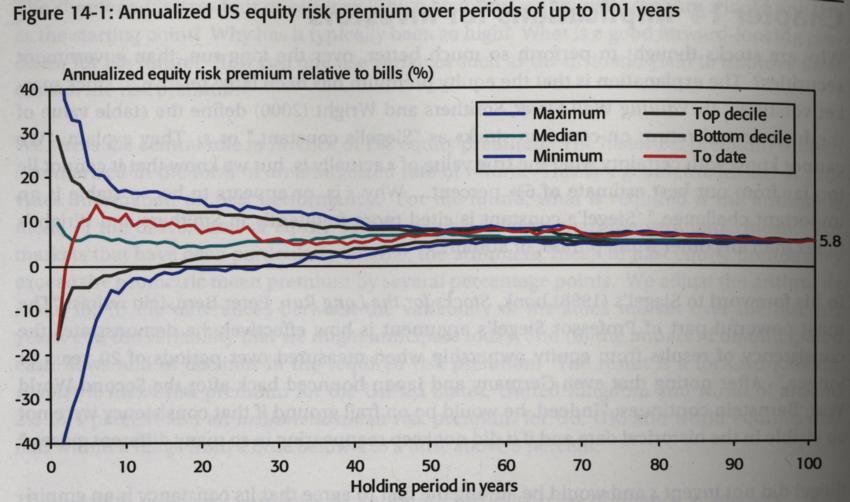
Figure 14-1 [copied below] measures on the vertical axis the risk premium for US equities, analysed over intervals of all possible length from the last 101 years. We show the full range of premia that could be computed if data were used as at any year-end between 1900 and 2000. At the left-hand side of the chart, plotted against a value of one year on the horizontal axis, is the range of one-year equity risk premia.
The chart embraces 101 estimates of the historical premium, where the latter is based on just a single year of returns. That is, we estimate premia over the years ending at December 31, 1900, 1901, 1902, and so on to 2000.
We plot as blue curves the minimum (0'th percentile) and maximum (100'th percentile) of the distribution of the one-year estimated premia; as grey curves, the bottom decile (10'th percentile) and top decile (90'th percentile); and as a green curve, the median (50'th percentile).
The horizontal axis of Figure 14-1 shows the number of years used to compute the equity premium. When two years are used, we are assuming investors estimate risk premia on a rolling biannual basis. There are 100 two-year investment periods, namely, 1900 – 01, 1901 – 02, and so on to 1999 – 2000. The range of estimated premia is narrower over two years than over one.
It narrows further, as a successively larger number of years is used in the calculations. Eventually, at the right-hand side of Figure 14-1, the equity risk premium is the annualised figure over the entire period 1900 – 2000. This reports the investment experience of a (now rather elderly) investor who bought stocks at the end of 1899 and held them to the end of 2000.
To review, we summarise 5,151 equity premia in Figure 14-1. This comprises 101 annual premia, 100 biannual premia, 99 triannual premia, and so on to 2 100-year premia (covering 1900 – 99 and 1901 – 2000) and one 101-year premium (covering 1900 – 2000).
Two features of Figure 14-1 support the opening comments of this chapter. First, over the long haul, annualised real US equity premia converge toward the long run geometric mean of 5.8%. Given the 0.9% annualised real return on US Treasury bills reported in chapter 5, this premium is consistent with Siegel’s “constant” of s = 6 ¾%.
Second, for all investment holding periods of around 20 years or more, equity premia have been positive all within a fraction of a percentage point of zero. A line for the 0.9% real return on bills, Figure 14-1 confirms Siegel’s (1998) observation of the superiority of stocks for the long run, where the “long run” is defined as 20 years or more.
To what extent should we rely on such patterns persisting into the future? As we said earlier, one of the critical factors that influences these results is sampling error. Sampling error arises because we observe only a limited number of historical outcomes. Looking to the future, there are an infinite number of possible stock-market returns.
If we are interested in a one-year investment horizon, we may use the past as a guide, and Figure 14-1 displays a summary of no less than 101 historical one-year premia. We can see the wide dispersion of possible annual premia, ranging from a worst ever premium on US equities of -45% to a best ever of +57% (note that these two extreme points run off the scale of the chart). The arithmetic mean is 7.7%, with a standard deviation of 19.6%.
But what if we are interested in the likely performance of US stocks over a century?
Our historical record provides only two observations: over the period 1900 – 99 the annualised premium was 6.0%, while over 1901 – 2000 it was 5.7%. As a guide to the future, there might be many other historical one-century records, but our database is too brief to reveal them. More seriously, the number of independent observations of the long-term return is limited. There is really only one independent measure, not two, of the century long risk premium, since our two estimates of the annualised premium share the same data from end-1900 to end-1999. This is why our two century-long premia are similar.
Other investors may, of course, be focusing on a shorter period, such as 20 years. But of the 82 twenty-year intervals ending between 1999 and 2000, there are only five independent observations. Our sample is too small; the potential error from extrapolating from just five (non-overlapping) 20-year periods is too large. The narrow range of 20-year returns in Figure 14-1 is therefore likely to understate the dispersion that might, in the future, occur.
The other critical factor that underpins estimates of long-run risk premia is survivorship and success bias. Many commentators, ourselves included, interpret long-term historical returns to provide a guide to the future. The green median line in Figure 14-1 ends up, at the right-hand side of the graph, at an equity premium (relative to bills) of 5.8% per year. This 5.8% outcome reflects both what investors might reasonably have expected, plus the impact of chance on US markets. In addition to chance, however, markets are subject to change. Today’s stock market is quite different from that of a century ago.”
In this chapter, the authors assess what they have learned about “Long-term returns”.
“In writing this book, we set out to answer four big questions: How have stock markets performed over the 20th century, domestically and internationally? How has this compared with bonds and bills? What has been the impact of foreign exchange fluctuations? And what toll has inflation taken?
…
In every country, equities proved to be the best performing investment over the 20th century. In the United States, equities provided an annualised return of 10.1%, or 6.7% after adjusting for inflation. In the United Kingdom, equities provided an annualised return of 10.1%, or 5.8% after adjusting for inflation. The best performing equity market was Sweden, with a real return of 7.6% per year, while the worst was Belgium, with an annual real return of 2.5%
This was not the century for bond investors. In the United States, long-term government bonds provided a disappointing return of 4.8% per year, or just 1.6% after inflation. Risk-free short-dated treasury bills returned 4.1%, while inflation was 3.2%. UK bill and bond returns were similar. Five countries, Germany, Japan, Italy, France, and Belgium, experienced negative real returns on both bonds and bills over the century taken as a whole.
The poor performance of bonds arose from inflation proving to be higher and more volatile than expected. During the first half of the century, the average US and UK inflation rates were surprisingly low. This was because the years of higher inflation were partially offset by a period in the 1920s and early 1930s when prices actually fell. Deflation was not unique to the United States and the United Kingdom, but was common to all 16 countries at some stage during this era. For much of the second half of the century, however, UK inflation was pervasive, peaking at 25% in 1975.
But while the United Kingdom may view itself as having been afflicted by inflation, the countries identified above as having the lowest real bill and bond returns had worse experiences. In addition to the German hyperinflation of 1922-23, France, Italy, Japan, and to a lesser extent Belgium, all experienced very high inflation around the end of the Second World War. This dramatically affected bill and bond returns. While bills are normally regarded as risk-free, German bill investors lost everything in 1923. The same was true of German bond investors, who additionally lost over 92% in real terms after the Second World War. Interestingly, however, the countries that had the very worst inflationary experiences and the lowest bond returns over the century taken as a whole, were among the best performing bond markets over the last 51 years.
Financial market returns thus reflect the turbulence of the twentieth century. Through the lens of the markets, we can see the decimating impact of wars and their aftermath, inflation, high interest rates, stock market crashes, and the Great Depression. These events affected not only investment returns, but also the volatility of the financial markets.
Although equities gave the highest return in every country, they also proved the riskiest asset class. The real returns on US and UK equities had in both cases a standard deviation of 20%, somewhat below the average for the other countries in our study. This compares with a 10.0 (14.5) percent standard deviation for US (UK) bonds and 4.7 (6.6) percent for US (UK) bills. This ranking was common across the world. In every country, equities proved more volatile than bonds, while bonds were more risky than bills.
While real returns on equities have been higher than on bills and bonds, the margin is smaller than many investors have perceived. For the United Kingdom, this stems from shortcomings and biases in previous estimates of long-run UK returns. Before the privately distributed predecessor to this book, the most authoritative UK study indicated a real return on shares from 1919-54 of 8.8%. Our analysis shows that this greatly overstates the true return over the first half of the century: the real return from 1900-54 was just 3.8%.
Long-run equity returns and equity risk premia are also lower for other countries than has generally been perceived. This arises from “easy data bias,” the tendency of researchers to use data that are easy to obtain. Easy data generally excludes difficult periods such as those with breaks in trading activity, times of unrest and upheaval, and wars and their aftermath, and typically relates to more recent periods. Sixteen studies, which might hitherto have been taken as the standard reference for each country, generate a misleading impression of long-term investment returns by reporting equity returns that exceed the actual returns for the last 101 years by, on average, 3% per year.
While our international data are superior to that used in previous studies, they still have shortcomings. Although we use the best available sources, for certain assets in some countries the early data fall short of ideal. Since the initial pre-publication editions of this book we have already improved certain data series, and we plan further enhancements in the future. We hope to add one or two more countries, and to undertake further analysis. Meanwhile, we will keep our database current by continuing to calculate the new UK index series and periodically updating the returns for other countries.
We should also sound a cautionary note on our conclusions. The international data used and reported in this book have extensive coverage and a common start date. Despite this, our estimates of long-run returns around the world are still likely to be upward biased. This is in part because of the potential deficiencies referred to above in a small proportion of our international data for earlier years, which may contain some element of retrospective bias. But more importantly, it is because our study is confined to the countries for which total returns can currently be estimated. Our own work, too, thus suffers from easy-data bias.
Recently, there has been much concern in the literature about survivorship bias in markets. The concern is that long-run return studies, such as our own, document returns for surviving markets, and leave out the record for other markets which at some point failed to survive or experienced total losses: Russia, China, Poland, and so on. Omission of markets that experienced returns of -100% inevitably inflates our estimates of long-run average returns, although the impact on risk premia is less clear-cut.
While these concerns are legitimate, the emerging consensus is that they have been overstated (see, for example, Siegel, 1999). Our study lends weight to this view. While the sizes of stock markets in 1900 can be inferred only indirectly from GDP data, it is likely that the non-surviving markets that suffered total losses made up only a small proportion of the then total world capitalisation.
Furthermore, Germany, Japan, and other markets are sometimes cited as examples of non-survivors because of the war. Yet the histories we have assembled for these two countries show they experienced positive real equity returns of 3.6 and 4.5% per year, respectively. By comparison, the United Kingdom, which is often cited as a classic survivor with favourable returns, experienced equity performance of 5.8%, while the hugely successful US economy ranked as the third best performer, with 6.7%”
This book was published in 2002. I bought it in December 2007 after seeing it mentioned in “Investors Chronicle” magazine. However, I find that buying books is much easier than reading them, and I only read it last year.
The book is extremely authoritative and very clearly written. It is illustrated with a large number of tables and multicolour charts and the production quality is very high as one would expect given the price of the book.
Given the price, the book is unlikely to appeal to those who are only casually interested. However, if you have a serious interest in investment, and in particular if you have more than, say, £20,000 to invest, then I would strongly recommend reading it as it is very illuminating.
Follow @Mohammed_Amin